


Why Your Facebook Leads Are Trash (and Why a Strategy Overhaul is the Only Fix)
Mike Snellenberger , April 01, 2026
Struggling with low-quality Facebook leads? Learn why your leads aren’t converting and how to fix your strategy to attract high-intent buyers and increase dealership sales.
Read our latest blogs
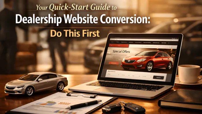
Your Quick-Start Guide to Dealership Website Conversion: Do This First
Your dealership website is getting traffic. But those visitors aren't turning into leads, test drives, or sales appointments. Sound familiar?
You're not alone. Most dealership websites leak potential customers at every turn: slow load times, confusing navigation, invisible CTAs on mobile. The good news? You don't need a complete website overhaul to fix this. You need to tackle the fundamentals first.
This guide walks you through the highest-impact, lowest-effort changes you can make today to boost your car dealership website optimizationand start converting more browsers into buyers.
Start With Speed: Your Site Loads Too Slowly
Page speed isn't a "nice to have": it directly kills conversions.
Here's the data: A website that loads in 1 second converts at 39%. Let that load time creep to 5 seconds? Your conversion rate drops to 22%. That's nearly half your potential leads gone because your site was sluggish.
Most car shoppers browse on their phones: during lunch breaks, while watching TV, sitting in their current car at a competitor's lot. If your site takes more than three seconds to load on mobile, they're gone. They'll tap back to Google and click your competitor instead.
What to do right now:
Run a speed test using Google PageSpeed Insights or GTmetrix
Compress your vehicle images (most dealership sites use massive, unoptimized photos)
Enable browser caching so returning visitors load pages faster
Reduce unnecessary scripts and plugins that slow your site down
Consider a content delivery network (CDN) if you serve customers across multiple regions
Actions that take less than 100 milliseconds feel instantaneous to users. Your goal is to make your dealership website feel fast, responsive, and modern. Speed signals quality: and quality builds trust.
Fix Your Mobile Experience First
Desktop traffic isn't driving your dealership anymore. Mobile is.
Yet most dealership websites still treat mobile as an afterthought. Tiny buttons, text that requires zooming, forms that won't submit properly: these aren't minor annoyances. They're conversion killers.
Your mobile checklist:
Test every page on an actual smartphone, not just a desktop browser resized
Make sure phone numbers are tap-to-call (no copying and pasting)
Ensure all buttons and CTAs are thumb-friendly (at least 44x44 pixels)
Simplify forms for mobile: fewer fields mean more completions
Remove interstitials and pop-ups that block content on smaller screens
Here's a simple test: Pull out your phone right now and try to schedule a test drive on your own website. If you get frustrated, imagine how your customers feel.
Mobile automotive conversion optimizationmeans designing for the thumb, not the mouse. Every extra tap, every pinch-to-zoom, every "this form won't work" moment sends a potential customer to a dealership with a better mobile experience.
Display Customer Reviews Where They Matter Most
Trust is currency in car sales. Online reviews build that trust faster than any sales pitch.
Northwestern University's Spiegel Research Center found something remarkable: When positive reviews were displayed for high-priced products, conversions increased by 380%. Not 38%. Not 80%. 380%.
Most dealerships bury reviews on a separate testimonials page that no one visits. That's a massive missed opportunity.
Where to place reviews:
Directly on your vehicle detail pages (VDPs) next to lead forms
On your homepage near your primary CTA
On service pages where customers book appointments
In your inventory search results
Use real customer reviews: full names, real photos if possible, specific details about their experience. Generic "Great dealership!" testimonials don't work. Specific stories do: "Jim helped me find the perfect F-150 for my landscaping business and got me approved the same day."
Pair those reviews with your lead capture forms. When someone's reading about how smoothly another customer's purchase went, that's exactly when they're ready to reach out.
Make Your CTAs Impossible to Miss
Your website has calls-to-action. The question is: Can visitors actually find them?
Clear, persistent CTAs transform browsers into leads. Confusing or hidden CTAs waste all the traffic you're paying for.
CTA best practices for dealerships:
Use sticky CTAs on mobile that stay visible as users scroll
Place CTAs on every important page: homepage, VDPs, service pages, about page
Use action-driven language: "Schedule Your Test Drive," "Get Your Trade-In Value," "View This Month's Specials"
Avoid aggressive language like "Buy Now": car buyers want to explore first, commit later
Make CTA buttons stand out visually with contrasting colors
Test this: Scroll through your homepage on mobile. Can you still see how to contact you or schedule a test drive when you're halfway down the page? If not, you're losing leads.
The best CTAs speak to what the customer wants to do next. They're not about what you want (a sale). They're about what they want (information, a test drive, a quote). Frame your CTAs around their journey, not your sales process.
Simplify Your Navigation
Your website navigation should answer one question instantly: "How do I find what I came here for?"
Complicated mega-menus with seventeen subcategories don't impress visitors: they overwhelm them. Clean, logical navigation gets people to vehicles, pricing, and contact information fast.
Navigation essentials:
Keep your main menu to 5-7 primary options maximum
Make "Inventory," "Service," "Specials," and "Contact" immediately visible
Use clear labels, not clever marketing speak (no one knows what "Drive Your Dream" means)
Include a search function for inventory
Add your phone number and address in the header on every page
Think about your customer's actual journey. They either want to browse inventory, get their car serviced, see current deals, or contact you. Everything else is secondary. Build your navigation around those four priorities.
Put Financial Tools Front and Center
Here's what most dealerships get wrong: hiding the information customers actually care about.
Trade-in values and payment calculators shouldn't be buried three clicks deep in your menu. They should be prominent on your homepage, your VDPs, and your search results pages.
Why this matters:
Car shoppers aren't browsing for fun: they're researching a major financial decision. They need to know:
What's my current car worth?
What would my monthly payment be?
Can I afford this vehicle?
When you make them hunt for that information, you create friction. Friction kills conversions.
Add a trade-in estimator tool to your homepage. Put a payment calculator on every vehicle detail page. Show this information upfront, and watch your lead quality improve: because customers who engage with financial tools are serious buyers, not tire-kickers.
Create Dedicated Landing Pages for Your Campaigns
Running Facebook ads for a spring sales event? Promoting a service special? Don't send that traffic to your generic homepage.
Landing pages built for specific campaigns convert dramatically better than sending everyone to the same page. A targeted landing page speaks directly to what brought the visitor there: the specific vehicle, offer, or service they clicked on.
What makes a good landing page:
Matches the messaging from your ad or promotion
Removes navigation distractions (no main menu competing for attention)
Features one clear goal: schedule appointment, get quote, claim offer
Uses social proof relevant to that specific offer
Loads fast (see point #1: this still matters)
Generic pages create confusion. Specific landing pages create conversions. When someone clicks on an ad for "$99 Oil Changes," they shouldn't land on your homepage: they should land on a page about $99 oil changes with a big "Book Now" button.
Track What Actually Matters
You can't improve what you don't measure.
Set up conversion tracking on your website. Not just page views: actual actions that matter:
Form submissions
Click-to-call phone taps
Chat initiations
Test drive requests
Service appointments booked
Use Google Analytics 4 or your website provider's analytics to monitor:
Which pages have the highest exit rates (and need improvement)
Where mobile users drop off
Which CTAs get the most clicks
How long visitors stay engaged
This data tells you what's working and what's wasting your traffic. Maybe your VDPs convert great but your service pages don't. Maybe mobile users love your inventory search but never complete forms. You won't know until you measure.
Your Next Steps
Start here. Don't try to fix everything at once.
Pick the biggest problem based on your current data (or educated guess if you're not tracking yet). Is your site painfully slow? Fix speed first. Getting mobile traffic but no mobile conversions? Focus there.
Make one meaningful change this week. Test it. Measure it. Then move to the next improvement.
Your dealership website doesn't need to be perfect: it needs to be better than it was yesterday. These foundational changes create that improvement without requiring a complete rebuild or a massive budget.
Need help prioritizing what to fix first or executing these changes effectively? Get in touch with our team: we specialize in automotive conversion optimization that actually moves cars off your lot.

MENU
Contact
© Copyright 2026. The Fractional CMO Team. All rights reserved.
Facebook
Instagram
X
LinkedIn
Youtube